A photography project looking at areas that we have never done. I chose oysters as my topic because although I dislike raw food but people always mentioned how good oysters are, so I set myself a challenge to 'try' and taste oyster. And through photographs I conveyed the idea of the repulsion that I always get when thinking about raw food especially having already tried oysters, it made me feel nauseous even thinking about it.


 I showed this through a series of photographs, using a glass as a symbolism of my stomach, I created an atmosphere from a 'clean' stomach to a 'filthy' and 'stained' stomach.


 From one portrait's expression I demonstrated the claustrophobia feeling that one may experience in a small house.
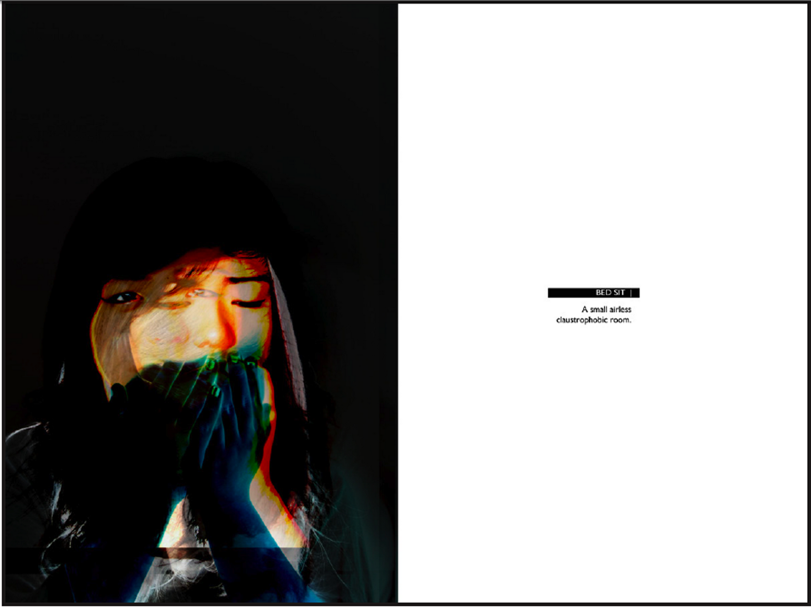
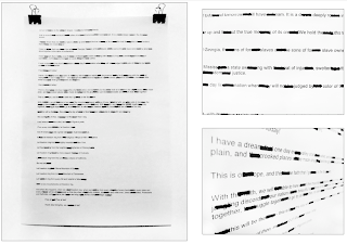
 This is an improvement of the poster. I played around more with the idea of legibility, but at the same time consider the visual aspect. To do this, I considered the title "I am not here" being invisible thus I decided to experiment with the idea of erasing some parts of the letters and consider at which point it will still be legible as a letter. Also 'overlaying' all texts onto the background gave another layer to the poster - making the bookshelf seemed to be popping out and the texts acts as a wallpaper.


