Saturday, January 8, 2011

Universal Principle of Design

A 4-day layout exercise, initially I was working with my friend Junko and we were given a list of houses for our primary research. During the research and experimentation, we have explored in many directions in terms of type, object and image.

We created typography from cutting and sticking traced floor plans. The typography that we created for Mansion was the most successful ones - when we overlap the type together, an image of richterscale was illustrated which linked quite beautifully to the idea of Mansion being old.

I used the idea of maze to represent a Mansion. The size and the huge amount of walls in a mansion can be a challenge to get from one room to another. Click on the image to enlarge.
From one portrait's expression I demonstrated the claustrophobia feeling that one may experience in a small house.

Seeing and Reading

This is a project that I did earlier in the year and wasn't that pleased with it, since I didn't get to experiment much on the typography area. So I've decided to rework it and finally got around with it. This is the previous poster that I handed in - I used one of Rachel Whiteread's pattern work as a template for the poster. It was very simple, at that point I wanted to express the idea that most of Rachel Whiteread's work are about sculpture and through the repetition of pattern, somehow a 3D image is created.
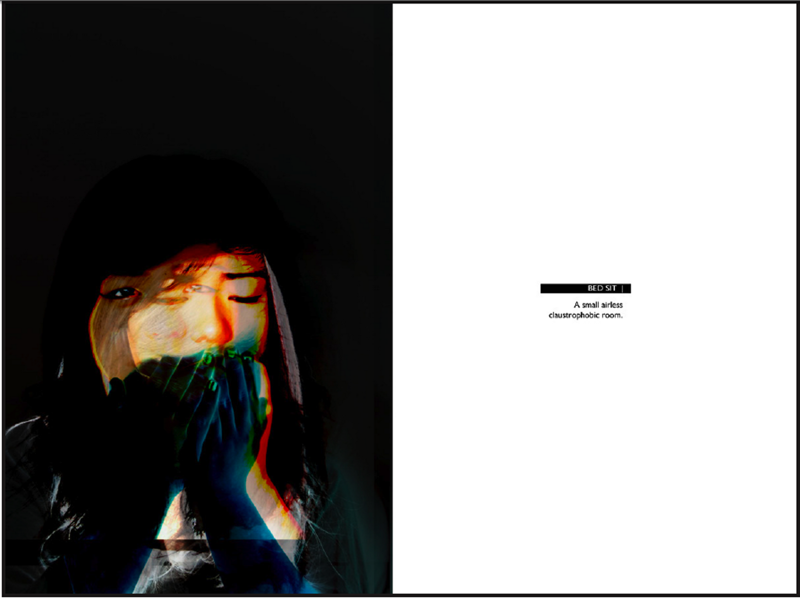
This is an improvement of the poster. I played around more with the idea of legibility, but at the same time consider the visual aspect. To do this, I considered the title "I am not here" being invisible thus I decided to experiment with the idea of erasing some parts of the letters and consider at which point it will still be legible as a letter. Also 'overlaying' all texts onto the background gave another layer to the poster - making the bookshelf seemed to be popping out and the texts acts as a wallpaper.

More Development... (Final)

Typography has never been my strongest area. When it comes to inventing a new kind of type, I had to do more experimentation than usual.
By cropping off some parts of a letter - making it just enough to notice what letter it is, the notion of seeing and reading simultaneously is confronted - to which extent it is still readable as letters. The idea of positive and negative space is used to closely relate to the meaning of the title 'I am not here'

Paris 25/12/2010

These pictures are taken when I went to Paris last December, in my attempt of continuing on my colour photography; capturing only colours..

Wednesday, January 5, 2011

When Five Fell

When Five Fell by Wong Fu Production
Can the things we love, love us back just the same? Five household objects express their feelings toward their owner when she begins to neglect them for someone else. "When Five Fell" is a new take on the ideal boy-meets-girl love story. Although the short is told from a unique and unconventional perspective, the emotions described should be familiar to anyone that's fallen in or out of a relationship.

A Peace of Home

A Peace of Home by Wong Fu Production
A musical short for anyone who has ever missed home, or the feeling of what home is. After moving from her home in the city to the suburbs, a young girl finds a way to feel less homesick.

Colour Photography

This is one of the Photography project that we've done - the brief was to take colour photography, not considering the form/object, simply just the colour.


This was done in one day, walking around Kingston Town Centre - spotting colours. I had really fun taking these photos; considering I was quite worried about capturing simply colours in the beginning but as I wandered around, I spotted quite a lot - even in a very odd place like the light from the shops reflected to the metal bench. This project has made me more aware of really open my eyes and paying attention to all the things around me at the same time, looking at the environment in 360 degrees.