Tuesday, February 16, 2010

Induction Project Photography

This was the induction project that started my year off in Camberwell Foundation Course. It was a two weeks project, where we had to create a form or structure that can be adapted and altered to the proportions of the human body. We had to choose one pattern sheet and manipulate the shape into a 3 Dimensional shape solely by repeating the one shape over and over again.

The picture below is the form that I created; something you wear over your shoulder.
After being inspired by Wolfgang Tillmans photography. I decided to photograph my work in his style by, focusing on the intersections of the form.

Greenwich Photography

This was a three days offsite visit to Greenwich. We need to gather lots of research in this particular area for "Sense of the City" project. We recorded all sorts of things that we could find in the area - from photographing the places to collecting 3D objects.
As I walked along the Thames River; from the O2 to the Cutty Sark, I noticed there were lots of graffiti painted on metals and walls. Using that as my inspiration I based my theme on graffiti, and so, took a lot of photographs of metals and graffiti itself.

Marks & Spencer and Medusa

This was a follow up from the previous graffiti research. After the offsite visit, we developed our chosen theme further.
Since I chose graffiti as my topic, I researched on different artists, the typeface that people had created, and then did some brainstorming of what I think a city is made of.
During the research, I discovered that nowadays, many companies hire graffiti artists to design their logos to expand their business. Upon this discovery I realised that a city is made up of businesses - in other words - shops.
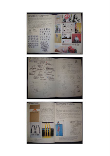
For further research, I went to Covent Garden to do some primary research on shops. I focused on one particular street, and collected some flyers that some shops give away and plastic bags.
From all of that research, Marks & Spencer's logo piqued my interest and so I did some brainstorm of what the logo looks like. I found out that one of the fundamental objectives of M&S is to help the economic development of Israel. Having thought of Israel and its background, it made me realise how Israel has so many aid from all different sources, and one of them are United States. These two countries have a very strong bond, United States often provided the first aid to Israel. Even though United States intention of helping Israel might be a good thing at the beginning but they're suffering from all sorts of crisis now; recession.
Medusa also started in good shape - a beautiful young woman but she was cursed at some point for something that Poseidon did to her (ravished her in the temple of Athena).
Both Medusa and M&S were what I called "cursed" for something that they didn't do. Since I was trying to alter the logo, to give it a twist in its meaning, thats why I've decided to use snakes to represent the logo.

A Way of Finding in Nurse's Bag

This was a 10 day project where we had to create a 'way finding' system through our chosen interior/exterior space, for somebody who does not know the space and to discover everything about the space through any media.

The space that I chose was woman's bag. Originally, I had this idea when I was looking around in Westfield Shopping Centre. And I thought, this project could be subjected to all the men out there, who always wonder what women carry in their bag.
The above is a photography piece. The idea was simple, I put each objects in a clear plastic bag and used strings to connect each objects together. The strings acted as a route, a map from one object to another and I used plastic bag, so it is as if a man is going through this bag and collects all the objects as an evidence.

But, I wasn't really pleased with the final outcome, I didn't feel it was finished, so I decided to use a different media. I made an audio tour showing the inside of a bag. This time, I chose one particular character in the woman society; Nurse and brainstormed what could nurse have in their bag. Nurse can be define in two ways; a diligent, serious nurse or a promiscuous, provocative nurse (women who dressed up as a nurse for halloween for example). Thus the objects in this video will be different from the previous photographs.

Chinese Whispers Zine

From the four topics that were given; conspiracy, lies, myth and propaganda, I chose lies as my own topic. I did some research on the famous lies that people told, which made me find out about the 'Balloon boy incident'. I did a couple of experiment based on that incident; different forms of typography and drawings.

Then, it gave me an idea of chinese whispers game, the famous on-going lies. I wrote down some quotes from the internet, news and I tried out the chinese whispers game with my classmates. The results were really good, and I got to use the quotes for my zine. It took me a while to figure out how to connect each pages and finally came up with the idea of drawing methods of communication in each pages such as; mouth, telephone, radio, mailbox, etc. This was done with the idea of 'connect the dots' because I wanted people to interact with the zine when reading it. And the little man that appears in each page is actually saying as if he is the one who tells the quote.

Schrodinger's Cat In Reality

Our Christmas holiday project was to choose one phenomena from the list that were given. Schrodinger's Cat was the topic that appealed to me the most, because I never heard of it and wanted to know more about this phenomena.
The original theory was that; an experimenter puts a cat into a box along with a flask of poison and hammers. Then the hammer will fall down and hits the flask of poison, when the flask of poison breaks, there is a 50:50 chance that the cat will breathe in the poison and die. At this stage, when the box is close, we say that the cat is alive AND dead. But when the experimenter opens the box, we say that the cat is EITHER alive OR dead. The whole point in this theory is that you have to open the box to get to know the answer.

I decided to take a humourous approach. The beginning of the video, I used the idea of the actual schrondinger's cat theory but at the end, I made a twist to make it funny.
I made about 90 pages of drawings in tracing paper. And then I scanned them in and put them into windows movie maker. Some of the slides I made it faster that others because some slides needed to last longer as there are writings on them that I want the audience to read.

Typography

This was a one day workshop on typography, where we were given a set of A-Z alphabets and 7 topics; decay, recycle, chance, explode, construct, evolve and deconstruct. We had to choose one topic and apply it to the A-Z alphabets, find a rule or a technique that can be used to re-form the whole sets of alphabets.
I chose deconstruct and my idea was simple, I pleated the letters a couple of times to create a different image.

Shop Local

This was a one week project where we had to choose a local story or cause and make a poster based on it.
My cause was to persuade people to shop more so it will increase UK's economy. And I summed up my topic into a sentence; a motto. At first I came up with "Shop together, Live together". We had one workshop were we experimented with the sentences; the placement of each letters, etc.
After a couple of experiments I realised my sentence didn't work really well, in terms of getting the message across.

The idea that I have for the poster was really simple. There were names of brands and I changed the sentence to "There is no need to ignore them", but the 'no' is deleted (white colour), thus the poster is encouraging people to shop local.


Graphic Music Score

Camberwell Festival week. We formed a band that consisted of 6 people and created a music instrument each from rubbish; cans, bottles, broken instruments, etc and we got to perform it within a week time.
After we performed our piece, we created a graphic score based on the performance.
Below is the graphic score I made. This idea was inspired by abacus; a counting frame that was used mostly in asia. When I was younger, I always play with the abacus that I have back home; not only for the arithmetic studies but I also liked it because it made a strange sound (the one I have). The shape of the abacus was actually quite similar to the graphic score, the little beads were triangular shaped. I used two colours; black and red in the score, the black represents the normal sound; medium normal sound and the red represents the dynamic; crescendo.

Sinister

We had to create an A5 black and white artwork of something sinister. I did some brainstorm of what sinister means and what can it be.
I came up with the idea of murder. I thought it will be more interesting if I don't show the actual act of murder, so I decided to use the 'left behind evidence'. I created a scene, imaginary. The murder took place on a chair; hand prints acts as the evidence. And I also show the method of the murder; strangling (the invisible hand).

Letterpress

This was a one day letterpress workshop that I signed up for. In the workshop, we were given six letters in random and I got; C, K, M, O, G and Q. We could use these letters to create a word or anything that represents some of the letters.
I decided to use the letters G, O and M and come up with random words that starts with these letters and join them into a three word sentence.
I experimented with a couple of different typeface and ended up choosing 'castellar' typeface. I really like this typeface because it gives an ancient, vintage feel to it.
At the end of the day, after I produced my letterpress, I was really pleased with all of it, from the typeface to the colour that I picked and mixed. I really enjoyed doing this workshop, something I wish to do again for the upcoming project.